Petition Flow
In redesigning their petitions, GreaterGood hoped to simplify the cumbersome form and better manage the hard to scan, but necessary, petition content. Using contextually aware UI and progressive disclosure, I simplified the experience to a clean, one-page, process.
Client:
GreaterGood/Charity U.S.A
Problem:
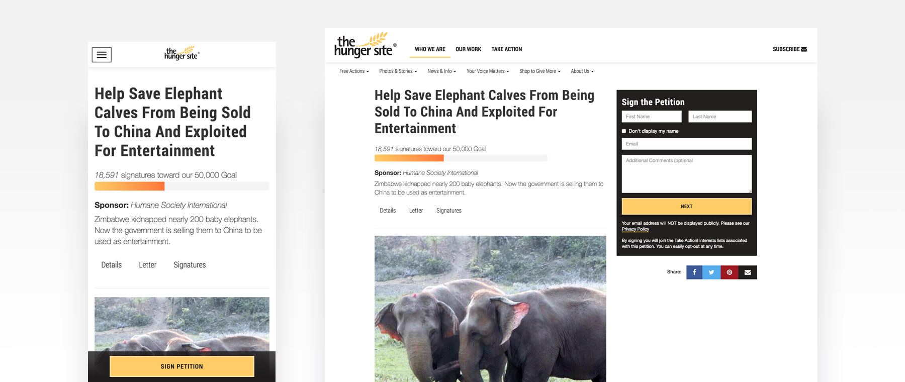
With the overhaul of their ClickToGive sites, GreaterGood wanted to incorporate the same design system into their related properties. Petitions had more problems than branding though. Not only were they unusable on mobile, but they were difficult to scan, because of long sections necessary to the petition processes. To even sign a petition, users needed to complete a page long form.
Goals:
- Get more users through the petition process
- Get more users to return and complete more petitions
- Acquire brand-committed users
Approach:
I knew the petition experience had to be broken up and certain aspects of the single petition page had to be demoted visually, though still available. This as true on desktop and especially true on mobile. I also knew that having the right UI stick to the viewport would allow the semi-hidden pieces to become more discoverable and also increase conversions.
After wireframing, I used InVision to communicate my idea. Once approved, I was able to quickly fit the design into the existing Bootstrap framework, adding a few new elements.
Deliverables:
The front-end web code, fully responsive, for the petition experience– complete with a sticky petition “wizard” that loads with the individual petition page. The same flow sticks on desktop, along with a jump nav revealing the full petition text (which can be lengthy) and the signatures, both partially hidden.
Tools: Sketch, InVision, HTML/CSS/Javascript, Bootstrap